Done as a branding exercise for this portfolio.
Most logos that consist of initials — also known as lettermarks — tend to look very similar for many reasons, but most notably because there are only so many ways to rearrange letterforms in the Latin alphabet that makes up the English language, especially while keeping those letters recognizable as such.
In short, simply rearranging my initials — “RK” — wasn’t going to cut it.
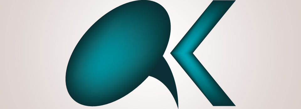
The Balloon and Bracket logo is a stylized lettermark, designed to look different from the typical logos that come up on a Google Image Search:
- The “R” of the logo transforms into a comic word balloon, a ubitious element of sequential art as we know it. It’s a simple balloon, with the tail pointing downwards to point to a speaker below who is, quite literally, “speaking up”.
- The “K” of the logo transforms into an angle bracket, used in HTML coding (as well as numerous other notations in computer science). Notably, this is an “opening” angle bracket — symbolising that many projects, no matter how excellent, remain incomplete if only because they’re never truly finished until exposed to the user.