This application has yet to be released in the respective App stores, which is why the name is withheld — I’ll update it with the name and fuller details once the app is available for download.
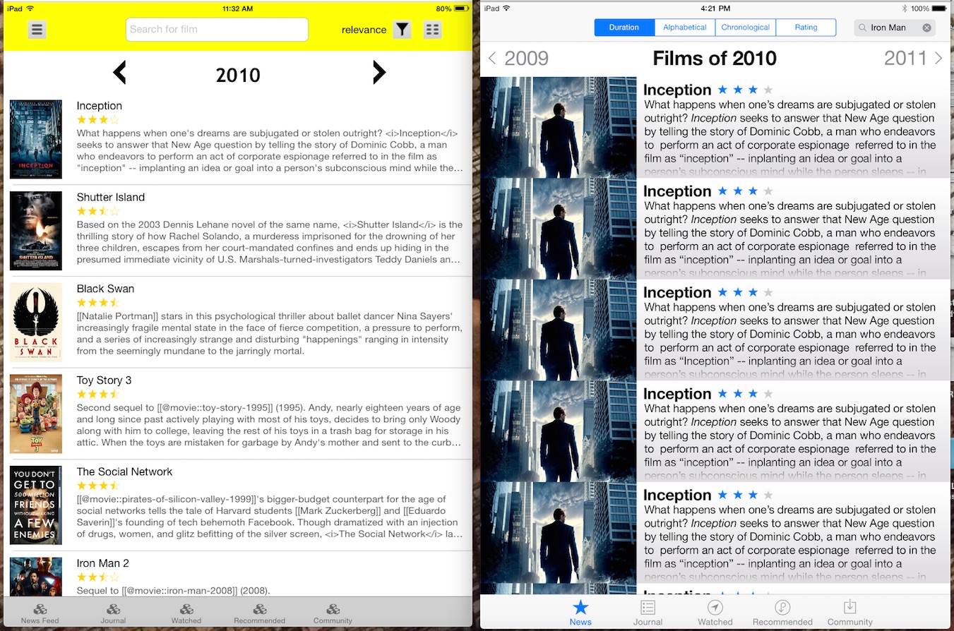
The application had some functionality prior to my involvement, but needed “polish” to bring it up to publishable standards.
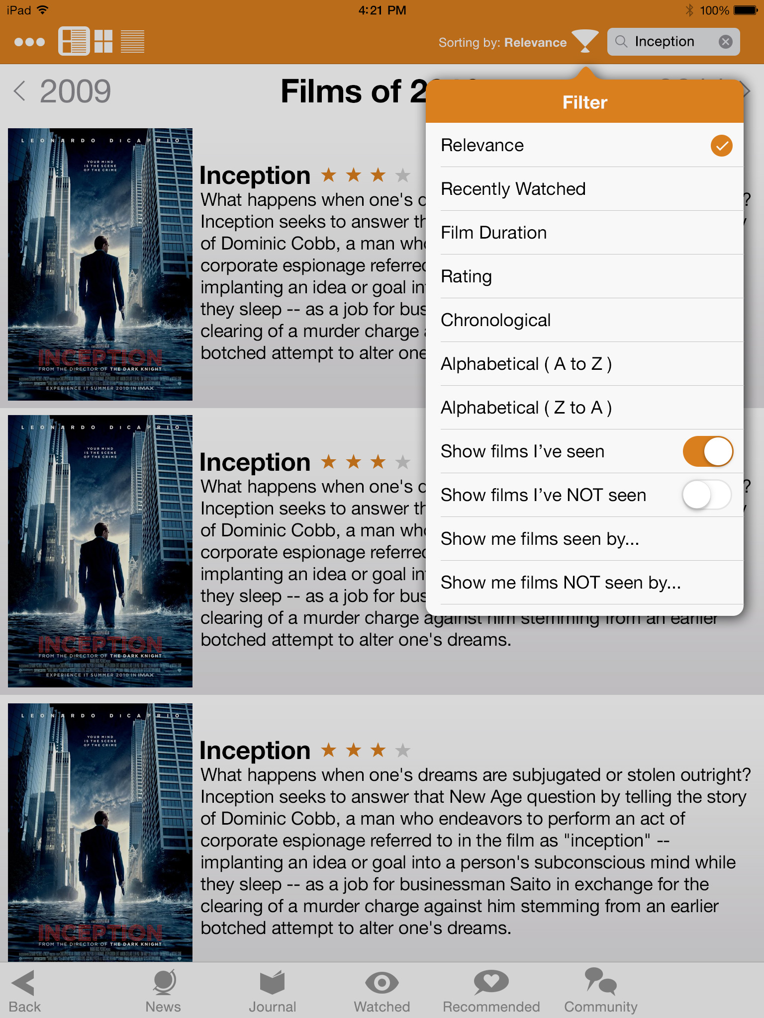
The image above is designed to show some of the earliest improvements — future improvements added color and some functionality images as well, including demonstrating the “filter function” of the app, designed to give people control to not just filter their artwork based on what they want to see, but what their friends have (or haven’t!) seen as well.
Icons were also illustrated for the application as well — including several variations of the “Community” icon before an appropriate icon was settled on.


Efforts were made to make the icons gender-neutral where possible — although the original community icon (top) was rejected for looking too similar to the “Recommended” icon, eventually being replaced by the cluster of people (dubbed “a pawprint”), and finally a pair of smaller, non-overlapping bubbles (bottom).

