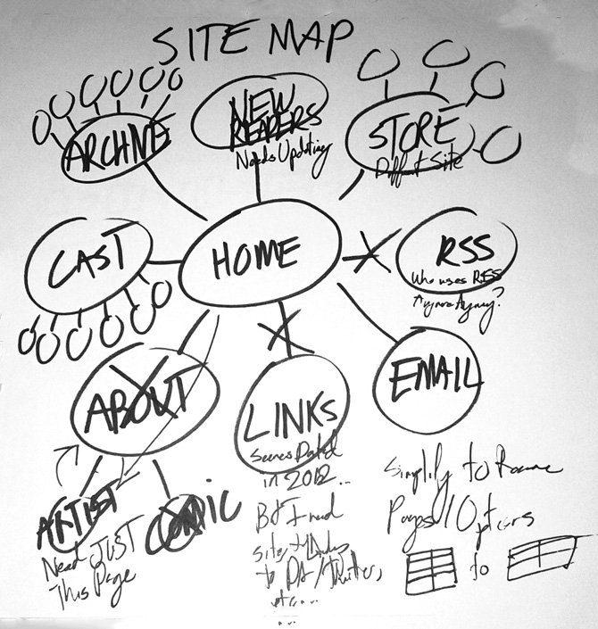
It’s a rough map (I’m not about to draw in 300+ circles for 300+ comics!), but this covers the general site architecture for lastres0rt.com.
Mostly, I wanted to see if there were any pages that no longer made sense to include inside the site navigation (which is important, as removing just two pages would simplify the mobile navigation by a row!) and figure out where things could be simplified or improved.
If nothing else, simplifying the site navigation would reduce the number of potential dead-ends in the site, as well as showing off more of the comic itself!
While I’m not sure about removing the links page entirely (especially as the site navigation uses it as a way to link to social media accounts) I found two pages I could remove — namely, the slightly redundant “about” pages! (Having an “About the Artist” page is valuable enough, but the other two pages in that branch? Cruft.)

