Most small businesses need a website, but only a fraction of them require a significant backend.
Carbon Age Systems is a manufacturing, fabrication, and design company in Atlanta, GA that specializes in engineering challenges and prototype development.
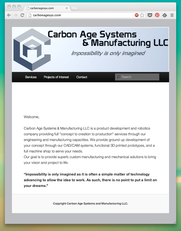
Before Redesign
The site in its previous incarnation is serviceable, but with no clear call to action — and in fact no real way for clients to contact Carbon Age aside from actively phoning or visiting in person (via the “Contact” link).
This is best referred to as A Website for the Sake of Having a Website — again, not every site needs to be like Amazon.com, but at minimum the site should have some end goal in mind, even if that goal is little more than “get people to fill out the email form at the end of the rainbow.”
There’s a reason for this though (besides the original owner’s ease in maintenance) — the site not only has to serve as a touchpoint, it should also convey a certain sense of competence, trust, and professionalism, especially when it comes to attempting to pick up government contracts. In short, the less the site looks like a fly-by-night, the better.
As an added complication, the header image changed — and since that header image was the only source of branding on the previous site, this meant that some pages had no brand reinforcement at all!
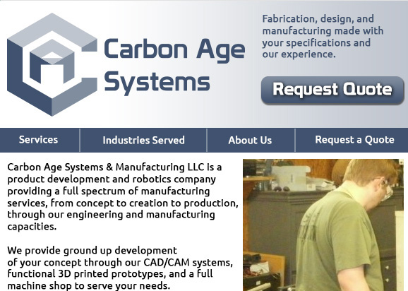
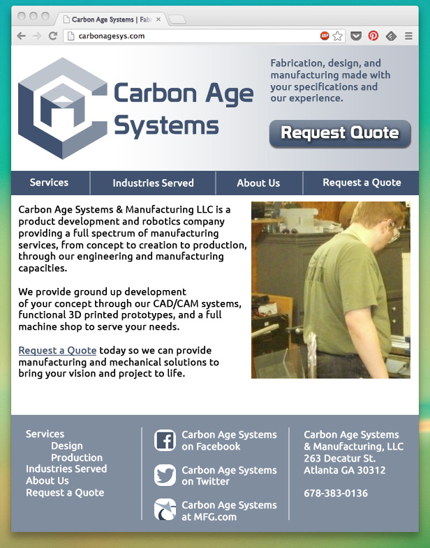
After Redesign
Changes made to the website:
- Unified color scheme to use just white + the three colors in the Carbon Age logo — improves visual branding and reinforces logo.
- Added more information to the front page — specifically, the footer, which included bringing that hidden contact information into the footer (so no matter which page the reader came to, they knew where to go and who to find)
- Added social media profile information to the footer
- Included a non-dropdown menu in the footer as an alternative interface
- Brighter, cleaner navigation (and elimination of that search bar — at this point, it’s faster to just click through all the pages than it is to search!)
- Clear call to action with the “Request a Quote” page, which contains a contact form that allows for direct email contact with leads to help qualify them
- Removed “page border” in favor of a wider responsive design, both to make better use of smaller real estate as well as providing more useful white space.


